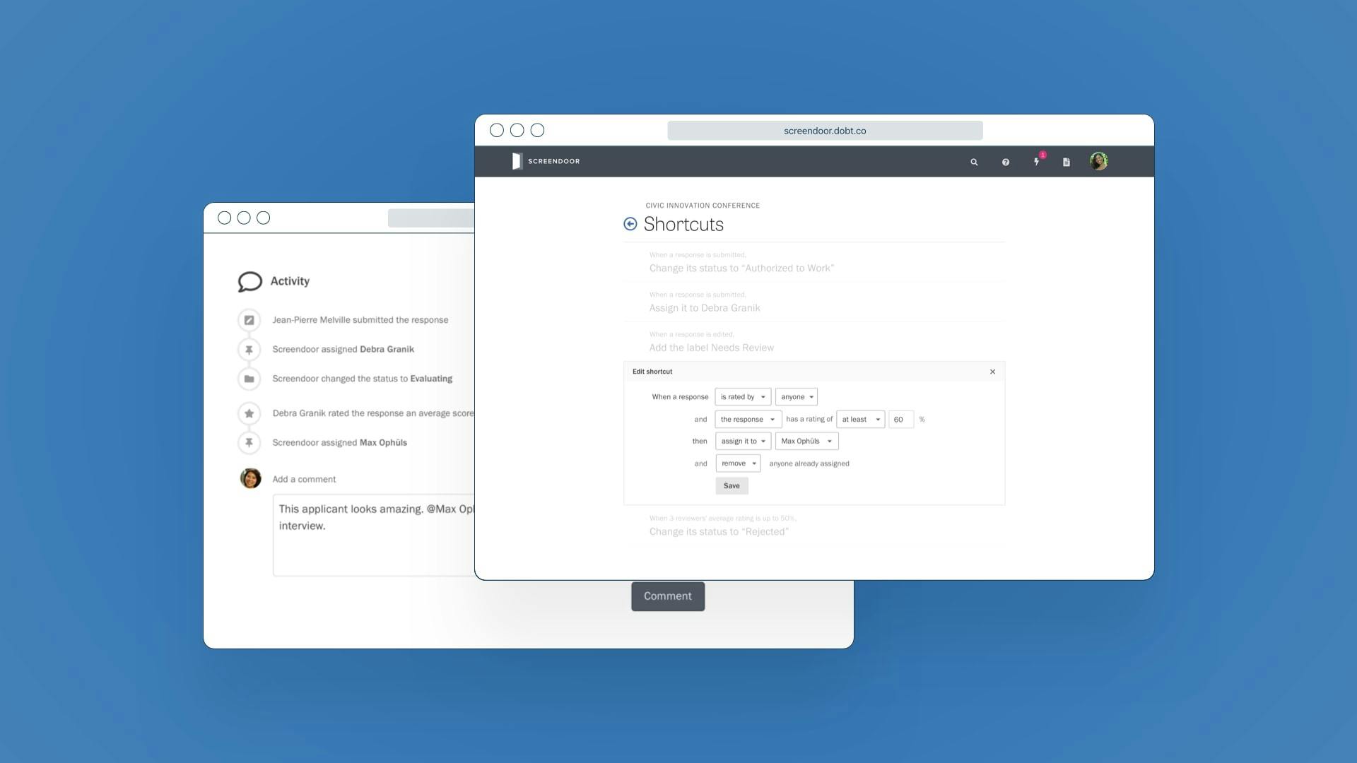
Screendoor was originally conceived of as a kind of social network for government forms. For example, businesses responding to RFPs could create an account to browse opportunities across multiple government agencies. But when we looked at our customer feedback and analytics, we knew this idea wasn’t working. Respondents were rarely interested in multiple Screendoor forms, and our network of customers wasn’t physically close enough to play a meaningful role in our respondents’ lives.
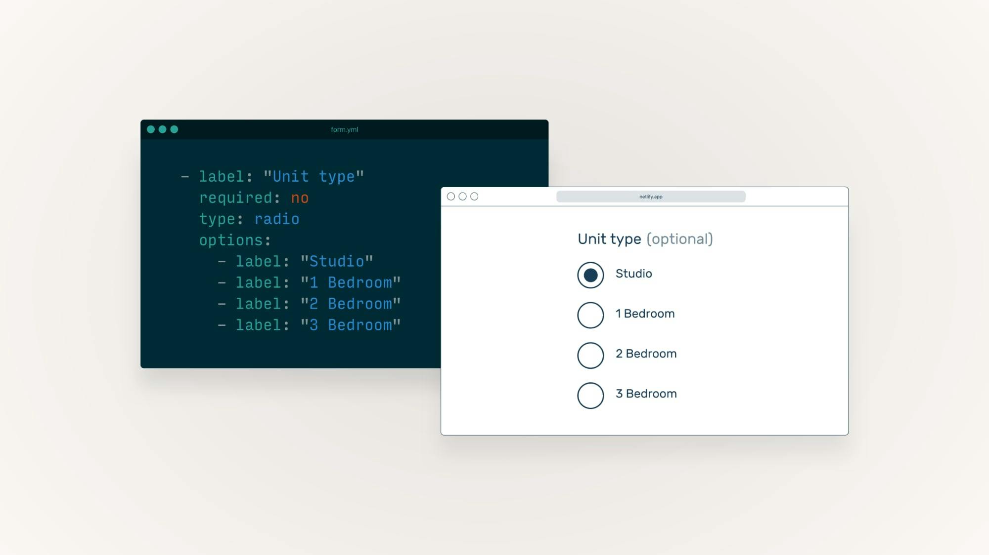
Also, as we expanded to new verticals like fellowships and innovation challenges, this strategy was a major usability problem. When respondents would visit an application form, they didn’t understand why Screendoor’s branding was so prominent. We decided to revisit our original assumptions and redesign the core respondent experience.
To understand how agencies were currently designing their own visual identities, we conducted an audit of design trends in highly-trafficked government websites. We noticed common misuses of photography: from lossy and overly enlarged images to poor contrast against foreground text. This led us to de-emphasize raster images in favor of bold typography and clear visual hierarchy.
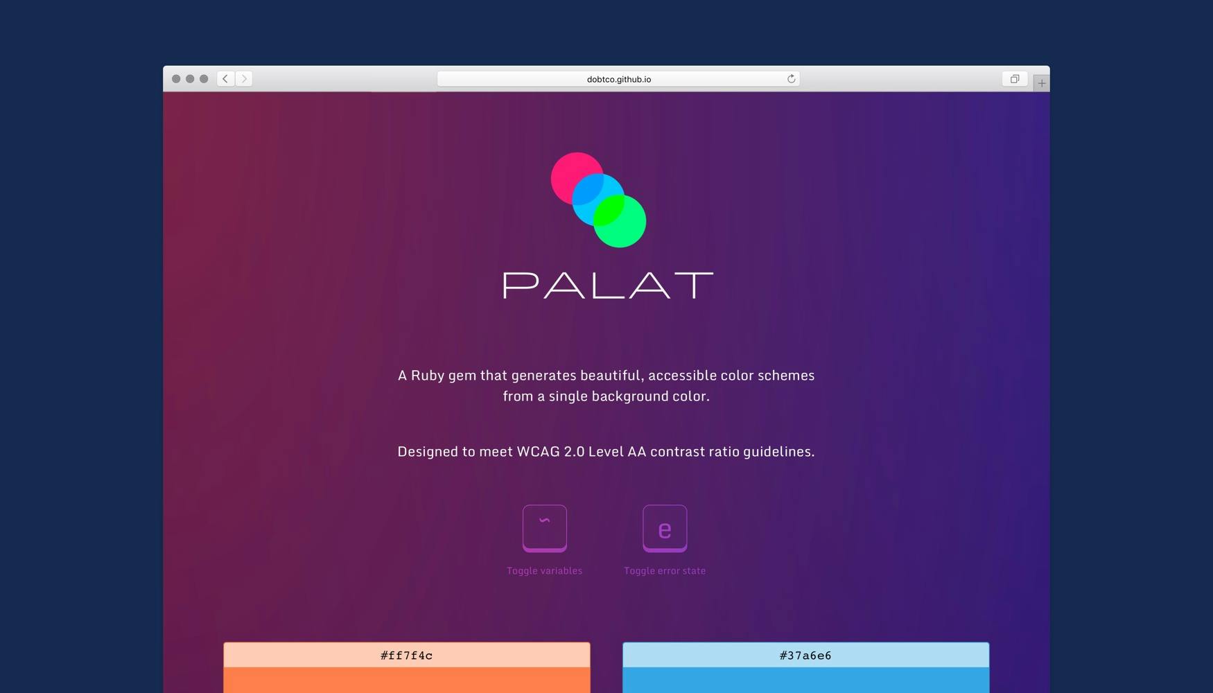
We wanted to empower customers to brand their forms as their own, while helping them adhere to best practices for legibility and accessibility. I developed a simple algorithm that automatically generates an aesthetically pleasing, WCAG-compliant theme from a single background color, which we used to let customers create a theme for their public-facing forms.
We later released this algorithm as Palat, an open source Ruby gem.