I’ve had the opportunity to design a few tools for building government forms. It can feel Sisyphean: there are so many out there, and it takes a ton of work just to reach feature parity.
Also, they all look pretty boring! You know that Jon Gold tweet about the two possible websites? Here are the two possible formbuilders:
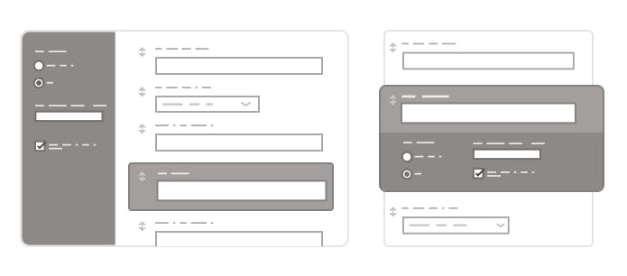
While Jon’s tweet poked fun at the design maturity of a certain type of website, I think you can attribute homogeneity in formbuilders to a lack of attention. Most form-building startups aren’t trying to innovate in their design, but rather identifying and catering to a niche that Google Forms serves poorly.
At my last job, our formbuilder was an afterthought, a way to feed data into the tools we built for processing and rating submissions. You could even argue that Google Forms is most valuable as a marketing tool for Google Sheets.
So the actual experience of designing a form hasn’t changed much over the last decade. Which is kind of a shame! Because the bureaucratic industries that rely on these tools (government, insurance, etc.) could really use some better ones. Most formbuilders out there are either hard to use or aren’t designed for the scale of the forms these industries need.
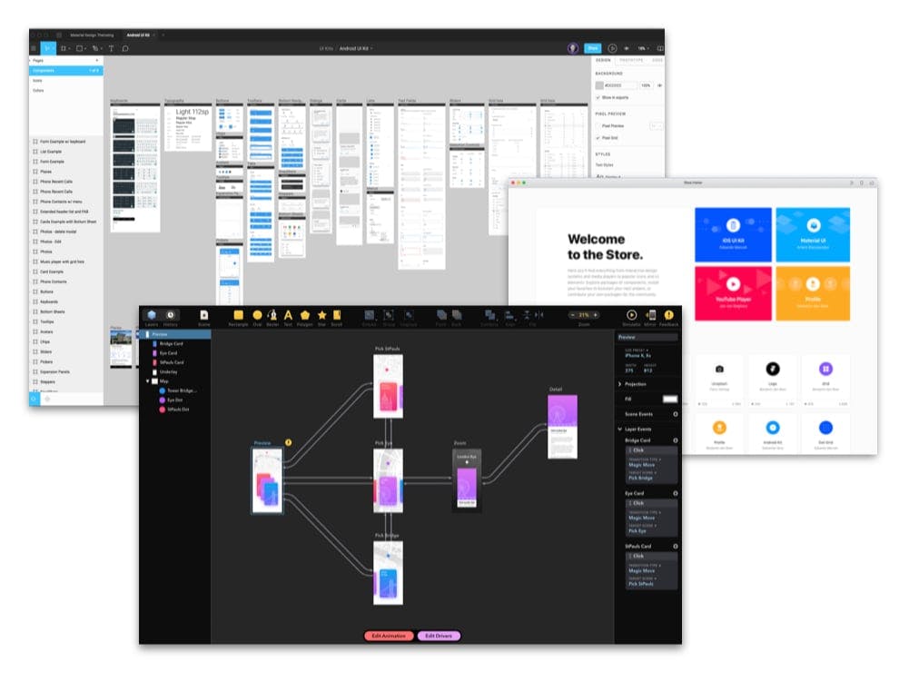
It’s a little ironic because there’s been this explosion of component-centric design tools for prototyping modern apps, like Figma and Principle and Framer:
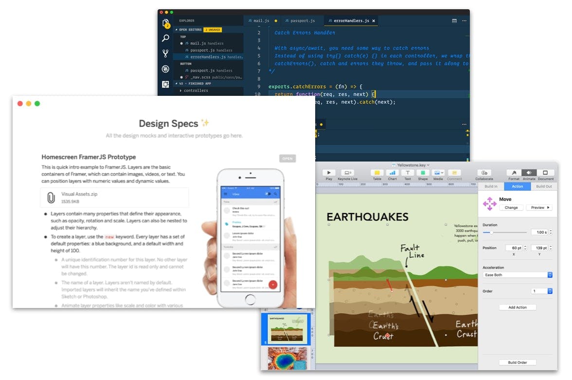
And there are even more tools to help you quickly, collaboratively edit big documents, like Notion and Keynote and code editors:
But a big government form isn’t either of these things. It’s a weird hybrid… an interactive document.
-
The process of designing a form is more like writing than drawing. There are a finite number of form elements to style, but so many ways to write a question, and so many ways to arrange them. Even simple government forms might have 50–100 fields that you may need to rearrange on the fly as you iterate on its design.
-
But you can’t validate a form’s design without looking at the real thing. Bad interaction design or engineering can render a form unusable. Things like janky inline validation, non-performant API lookups, and confusing conditional logic can all ruin someone’s experience.
Design tools can’t edit large amounts of content as quickly as a text editor might. Workshopping a form in a Google Doc doesn’t give you an accurate impression of how your respondents will experience it. Neither product category is a great fit.
In a perfect world, form designers would have a tool that bridged the gap between these two categories. Something with the efficiency and flexibility of a good text editor…
…that also gives you “higher-up” views of your work, making it equally easy to edit a form’s outline and content…
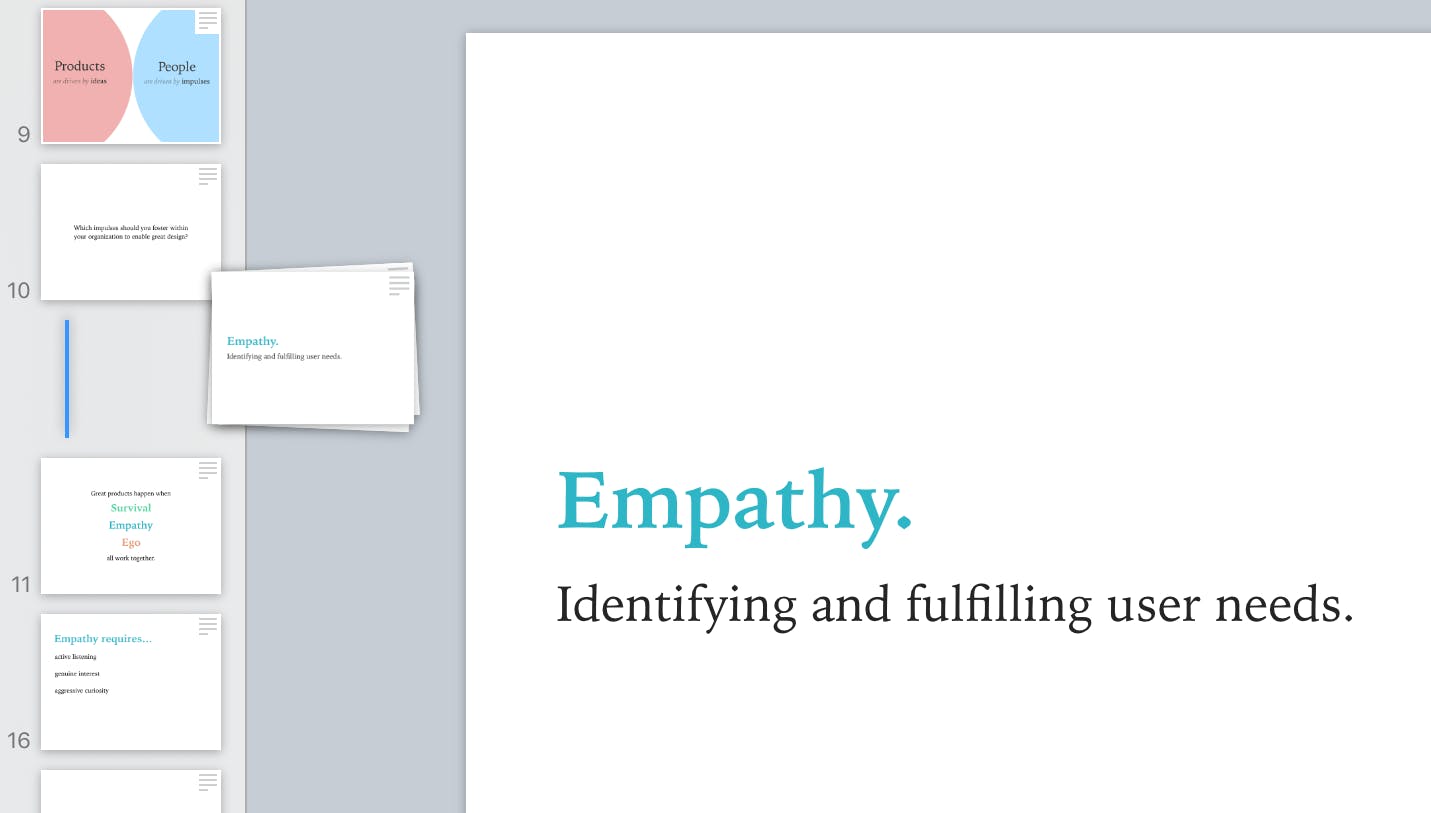
…while simulating your form’s real-world behavior, showing you how it might respond to real user input…
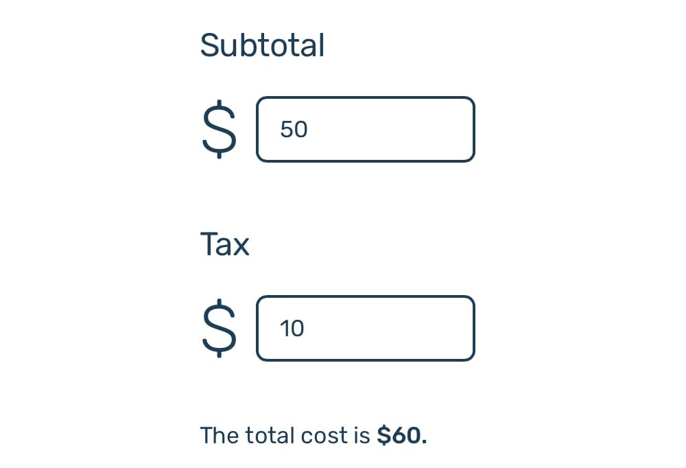
…and still manages to be just as simple to use as Google Forms.
That last criteria is crucial. Most government form designers aren’t actually designers: they’re writers, PMs, and policymakers. An effective tool would need to be accessible to people who don’t know how to code by hand.
It’s a tall ask, but it’s not impossible. At work, I’ve been trying to take some first steps towards this idea by… building my own design tool!
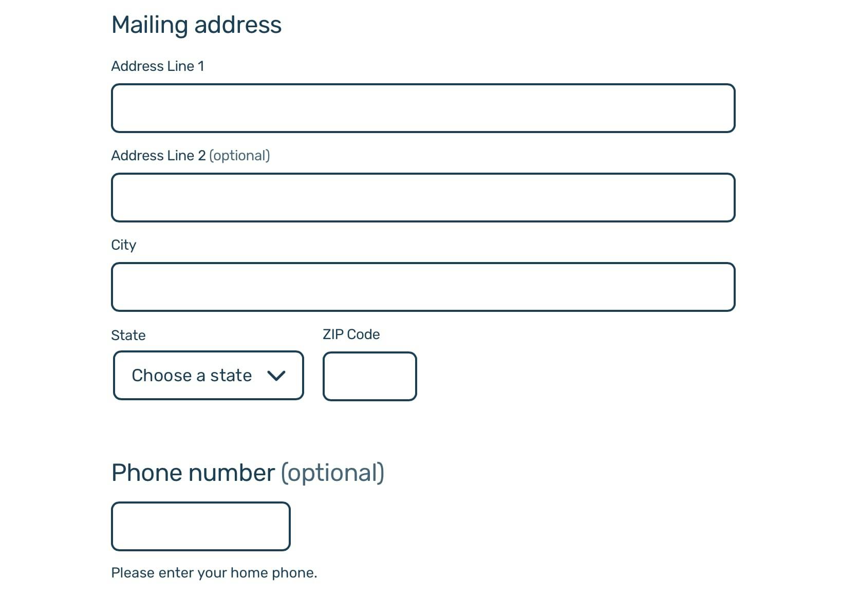
I’m trying to make it as easy as possible to have the best of both worlds: writing a form almost like you would an essay, while having the power to preview your form instantly on a live website.
So you can write something like this:
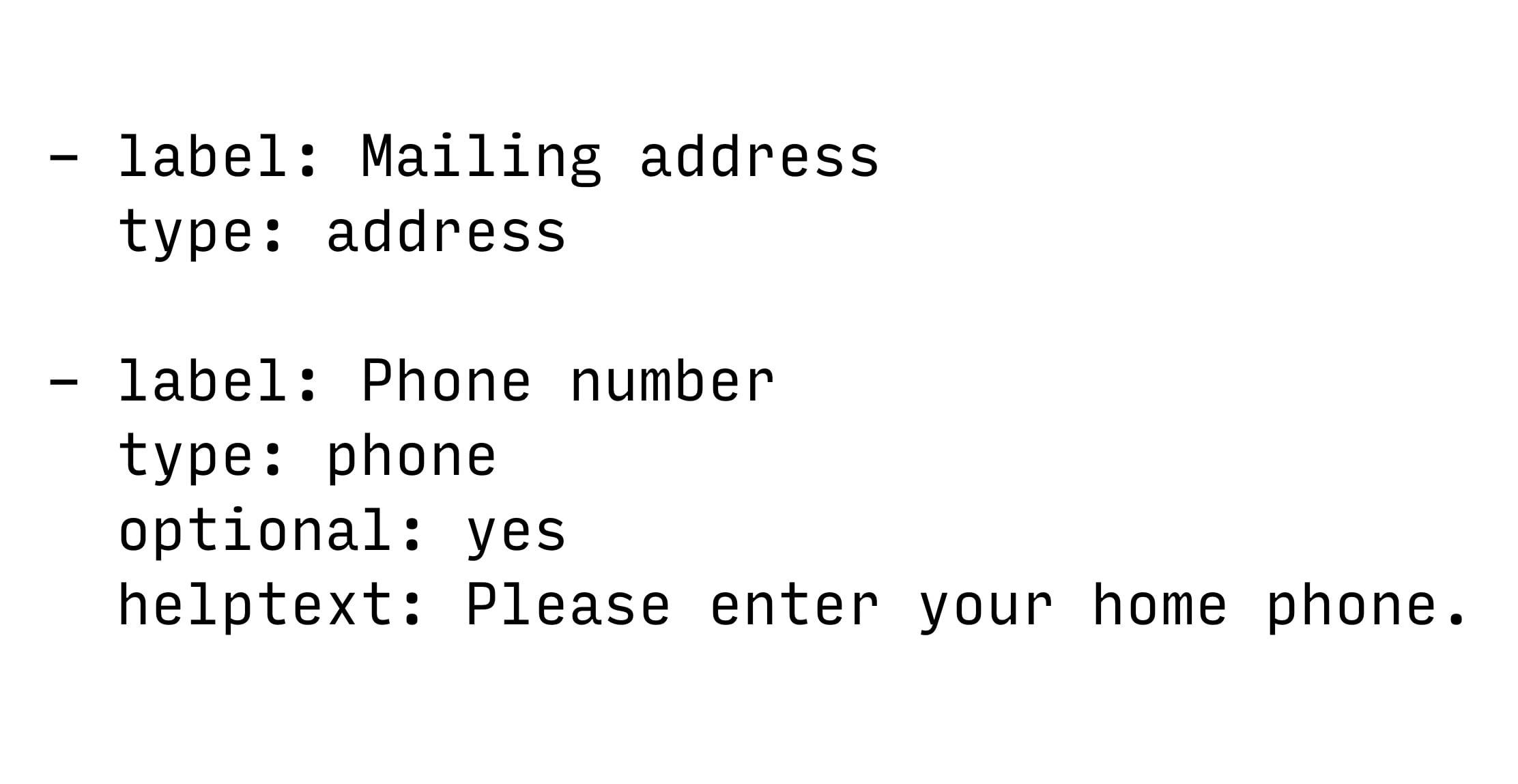
And it will generate this form:
You can even add conditional logic if you’d like. Writing this…
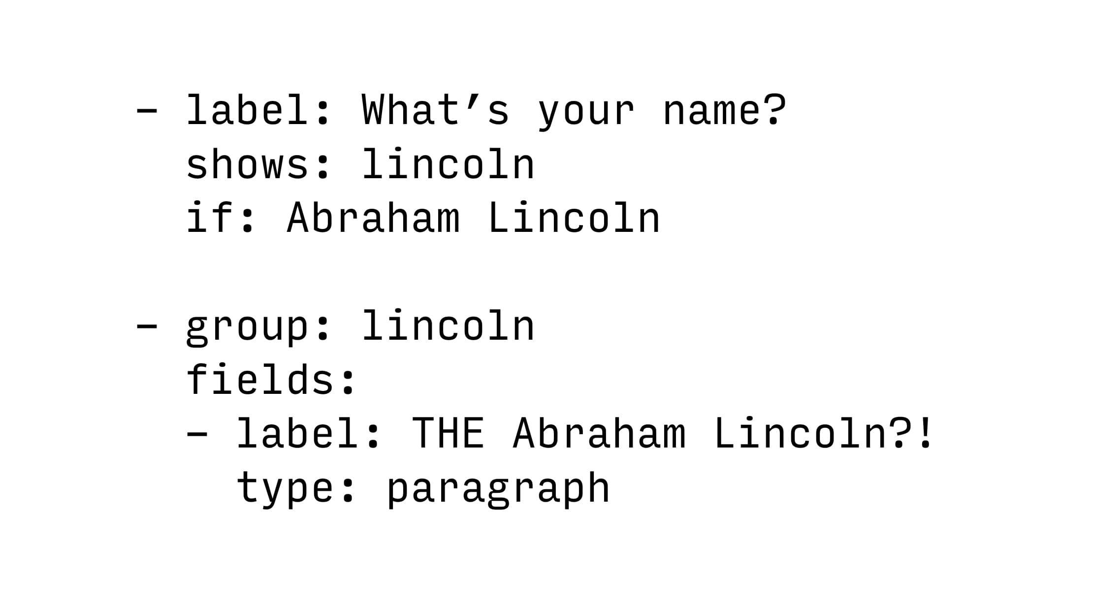
…would produce this form:

If you can get comfortable using a few terminal commands, you can build a complex form as fast as you can write.
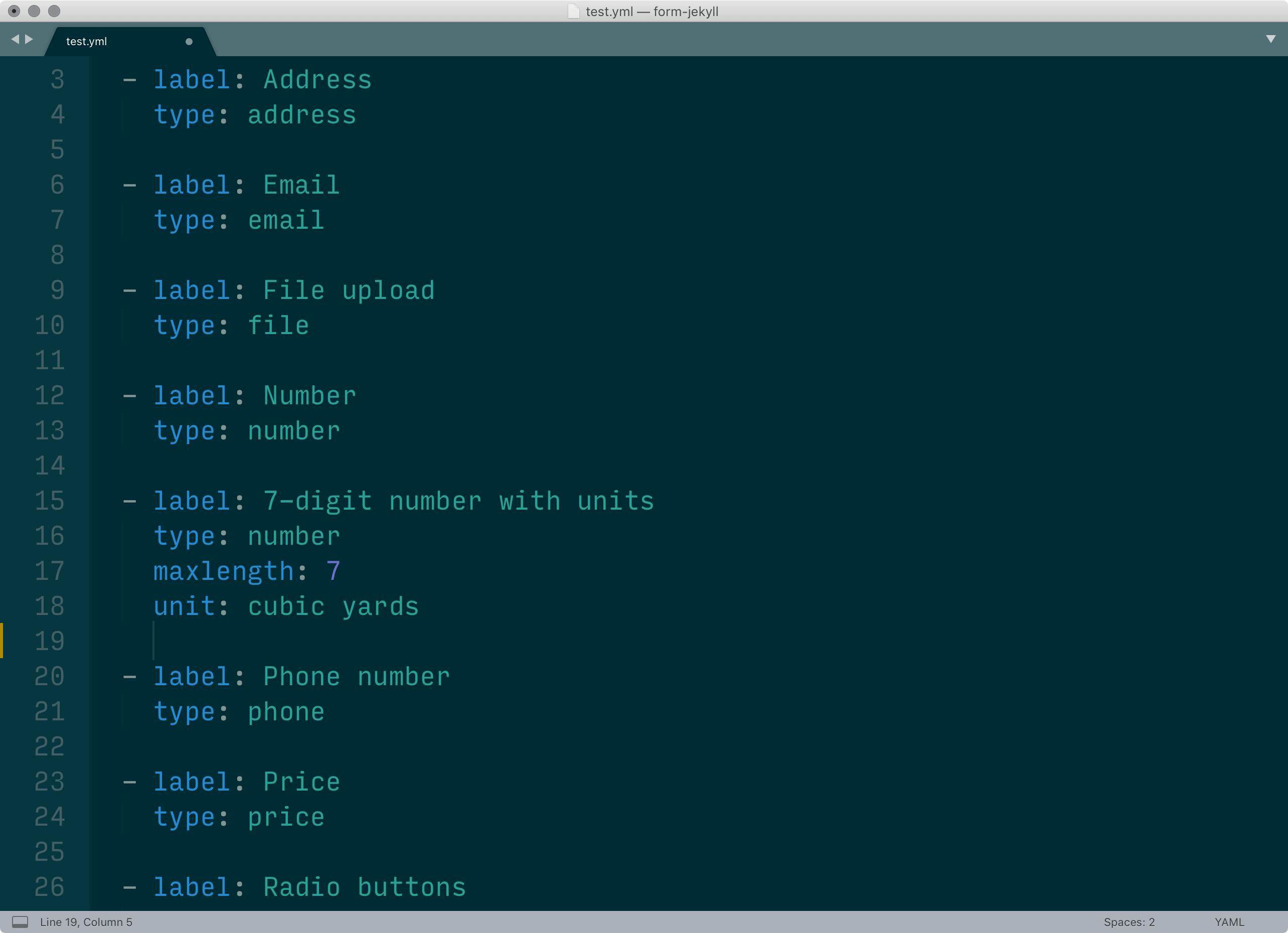
Since your form lives as plain text, you also get all of your text editor’s features for free. If you need to rearrange pages in your form, just cut and paste them. If you need to update a legal term that’s referenced in multiple form fields, just find and replace it.
And because the tool generates a static site, you can validate your form’s design by, well, filling it out yourself.
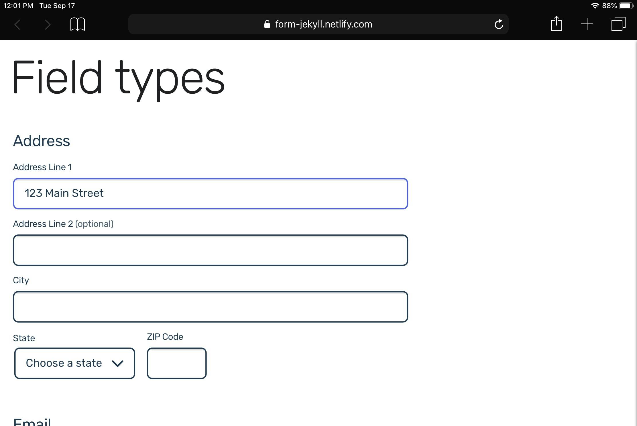
This definitely isn’t as accessible as Google Forms: you need a little bit of tech literacy to get started. But, as I use it to design forms at work, I’m noticing that I’m working faster in it than anything else I’ve used thus far. And while my colleagues haven’t used this tool just yet, it seems to be easier for them to read, and thus collaborate on, my work.
(If you’re interested in trying it out, here’s the GitHub repo.)
Govtech is super weird. Even though you’re working with a huge and powerful organization, procurement restrictions can make things challenging. It may take a while for government workers to get the tools they need, and due to the extended sales cycle, modern software companies may find it challenging to sell to them.
I think that’s why I’ve taken comfort in creating my own tools. When you can’t assume the inexorable forward march of software will solve your design problems, it feels empowering to improve not just the things you make but the way you make it.