Background
In 2019, applying for a permit in San Francisco was notoriously slow and complex. A single application could take years to get approved as departments shuttled paper plans between different city buildings.
To improve things, the city was building a new one-stop permit center to house all staff in one place. The city was also using this opportunity to rethink the entire permitting experience, both physical and digital.
I worked on the city’s Digital Services team, a new and rapidly growing department trying to modernize the city’s online presence. Since agencies weren’t mandated to work with us, we had to sell them on the benefits of a user-centered, digital-first approach. The permit center was a chance for Digital Services to prove its value, creating a success story that would help us expand our purview.
We started by tackling the permitting process for accessory dwelling units, or ADU. They’re an in-law unit, cottage, or residential unit you can add to your property. The mayor prioritized their construction to help address the housing crisis, so we felt like we had a good chance of success.
Goals
-
Digital Services can prove we can work across agencies to modernize a legacy process, giving us a success story to sell ourselves to more city departments and further our mission.
-
ADU permit applicants can save time completing forms and submitting architectural plans.
-
Our partners in other city agencies feel confident our redesigned form will make their work easier.
Defining the work
Before I joined the project, our leadership had told other agencies we planned to build or procure a number of products: everything from an appointment scheduler to a passwordless authentication system. Everyone on the team had a different idea of what we’d promised to deliver, and given the city’s lengthy procurement process, many were anxious about whether we could do so on time.
After a few weeks, I noticed we were conflating two milestones: what we’d promised our partners to deliver on a deadline, and what our research showed was necessary to deliver a meaningfully better experience. Although we had plenty of time to achieve the latter, we couldn’t do so unless our partners trusted we could fulfill our promises.
ADUs also marked the first time different Digital Services teams were collaborating on the same project, but no one had factored in the logistical overhead of coordinating. We hadn’t called out dependencies between teams, nor defined milestones for when we’d hand off work.
To help the team gain some clarity, I decided to try my best to map out the outstanding work, and try to build consensus from there.

I also sketched out a rough diagram of the applicant flow to help everyone understand where their work fit into the overall user journey.

These artifacts really helped the team build a shared mental model of the project. When presenting to partners, leadership frequently shared out my applicant flow, giving them greater context around their role. This also helped us clarify that the application form was the only project tied to a deadline, reducing the team’s anxiety.
Revising content
When applying for an ADU on paper, it’s easy to feel overwhelmed. Applicants must get 5–10 forms from different city agencies, fill out over 500 fields, and pore over pages of byzantine legal copy. We wanted to make this content more readable, concise, and internally consistent.
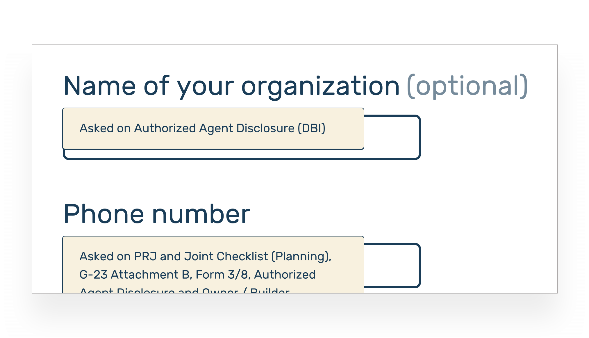
To start, we held content workshops with each of our partners to review the forms they managed. To focus the discussion, I blew up the forms onto multiple pieces of paper and pinned them to the wall, giving us a shared point of reference and helping our meetings move quickly.

From there, we triaged each question one by one, trying to understand why it was necessary and whether we could retrieve the answer from other sources.
After finishing each workshop, I rewrote the remaining content in a Google Doc to meet a 5th-grade reading level and align with SF.gov’s content style guide. To track which departments needed which answers, I used an emoji legend.

Because we were only working with a few city departments at this phase, we expected people to complete a bit more paperwork after applying online. On our form’s confirmation page, I used conditional logic to help applicants understand next steps.
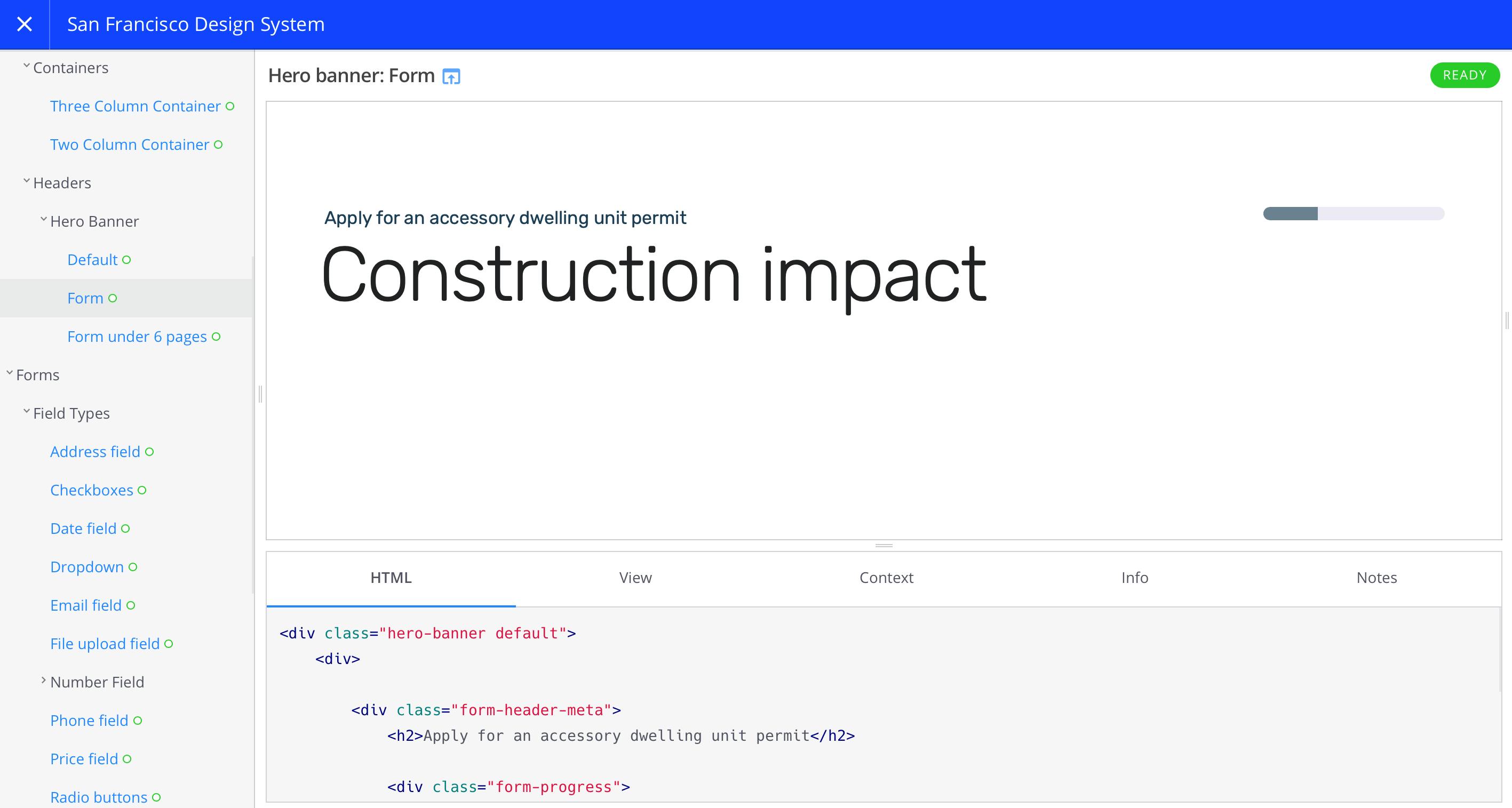
A new prototyping tool for complex forms
A clickable series of mockups can’t demonstrate things like inline validation, conditional logic or interaction latency, making it that much harder to foster a shared understanding of the project across teams. I wanted my prototypes to emulate the final product as much as possible.
I first tried to use commercial formbuilders, but none were a great fit. Digital Services planned to host the final application on our in-house formbuilder, but it wasn’t yet reliable enough to prototype with. Commercial alternatives lacked the features we needed or had serious usability issues around managing large forms.
I ended up developing my own tool, built on top of Jekyll. I’d write forms in YAML and Markdown, commit changes to a GitHub repo, and deploy my work in progress to a static site.

This gave me all of my code editor’s features for free. If I wanted to reorder pages in my form, I could cut and paste them instead of manually dragging over hundreds of fields. If I needed to update a common legal term, I could run Find / Replace instead of manually editing each field that referenced it.

Many partners weren’t on Slack and felt reluctant to collaborate through digital tools. Since my prototypes were just static websites, I could meet them where they were and just email a link.

To make my work easier to absorb, I added an admin panel that let stakeholders view the form in the way that made the most sense to them.
For example, our partners could view every page on the same screen, letting them scroll through the entire form in one place.

PMs and engineers could also toggle annotations, letting them see which department they should route each answer to.
I even embedded a Hypothes.is integration, letting content designers suggest and discuss edits inline.

Because the tool shared our in-house formbuilder’s CSS and validation library, we could validate these prototypes feeling confident our test participants were using something virtually identical to the final product.
On a personal note, I appreciated the opportunity to practice my JavaScript skills whilst adding pagination, conditional form logic, and the admin panel.
Having a single source of truth not only reduced communication issues, but made external stakeholders feel confident in our ability to deliver.
Crafting design patterns
Since this was going to be SF.gov’s first form, I also wanted to make sure I laid a solid foundation for the team going forward. At the time we didn’t have a design director, so it was up to me to coordinate our efforts.
I started by adapting SF.gov’s branding guidelines to create usable, accessible form components in Figma. Then, I facilitated a few rounds of design critique to make sure we were all on the same page.
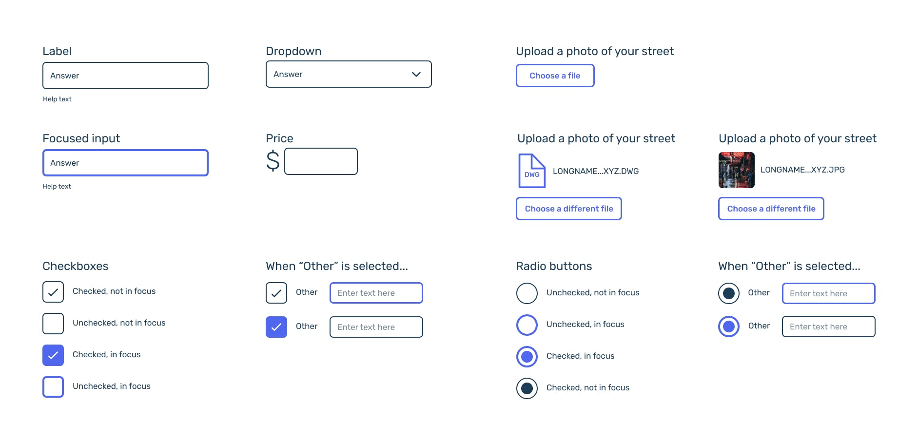
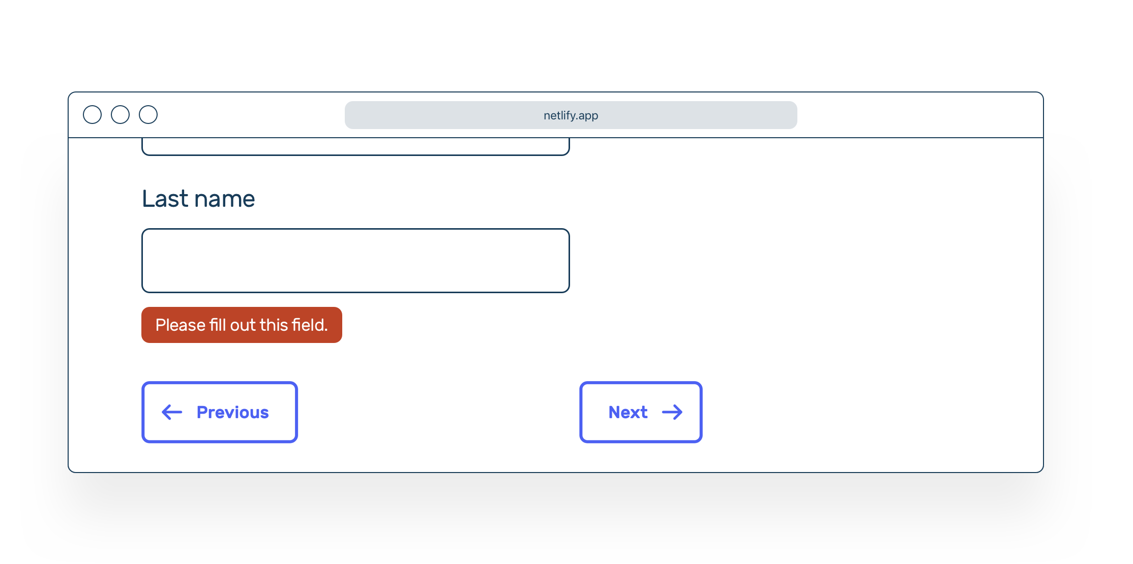
We tried to set a hard limit on the number of questions we asked per page, to help users easily spot validation errors and keep each page focused. This meant even a simple form could be 30–40 pages. I spent a lot of time exploring patterns to indicate progress, trying to make sure users weren’t overwhelmed while still feeling a sense of forward momentum.
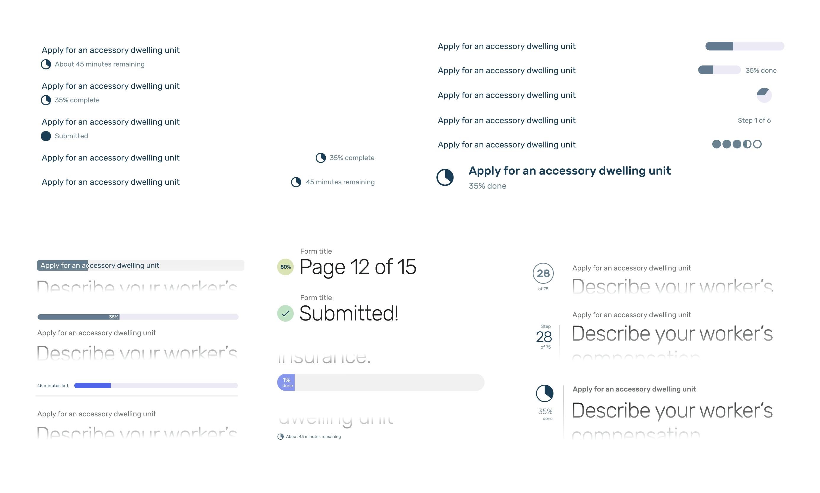
We settled on a linear progress bar for most forms, coupled with a simple page count for forms under 6 pages. Since the <progress> element had some cross-browser accessibility issues, I styled the bar as a <div> with text fallbacks for screen readers.
Revamping our pattern library
Once we’d defined our patterns, I wanted to implement them in a reusable way so my colleagues could benefit. We had a pattern library for SF.gov’s Drupal instance, but no one was really using it. Its styles were outdated; its list of components were sparse. It was also built in Twig, and since most Digital Services teams used different tech stacks, we couldn’t share it widely.
I started by converting our pattern library to Fractal. Then, I worked with the SF.gov team to update the existing components, write usage guidelines, and integrate the library with each team’s product.
Once that was done, I added the form components I’d designed so we could properly share them across Digital Services. Using our in-house formbuilder’s markup patterns as a starting point, I fixed scores of accessibility and HTML validation issues, aiming for WCAG 2.1 Level AA compliance. Finally, I brought these fixes back to each app.
I also extended these styles to our submission confirmation emails, creating modular blocks of template markup and testing them in Litmus.
Impact
When I left the city in January 2020, we had fulfilled many of our original goals:
- Our partners started to trust that we could deliver results, from our first prototype onwards.
- When we tested our work with permit applicants, we found they could finish our form faster than the old process.
- My design systems and content work helped make future projects easier for the Digital Services team.
When the form launched that November, an overwhelming percentage of applicants opted to apply online instead of on paper. It was a clear sucess story that helped Digital Services expand its purview going forward.
ADUs are one city government service of thousands. There’s still a huge opportunity for Digital Services to reimagine how San Franciscans interact with their government. I’m rooting for their success.