Background
Screendoor lets you build online forms, but it’s most valuable when processing the submissions you receive. You can sort submissions with statuses and labels, rate them with custom rubrics, and follow up on them by emailing respondents in bulk.
We built Screendoor for governments and non-profits, but we also had a healthy customer base of newsrooms who used us for audience engagement. We approached every project with three audiences in mind.
-
Users. Depending on the market, they might be civil servants, journalists, or non-profit employees.
-
Buyers. Like many enterprise software companies, our buyers were not our users. We had to consider what influenced the buying decisions of government purchasing authorities alongside user needs.
-
Form respondents. These were the people our customers served. Governments exist to serve their citizens, non-profits exist to serve their constituencies, and newsrooms exist to serve their readers. If respondents had a bad experience with a Screendoor form, we’d violate DOBT’s mission of social impact and likely damage customer retention.
Impetus
Our customers kept asking for a way to automate some predictable, repetitive actions. For example, here’s how a newsroom might process reader submissions:
- When we receive a submission… Assign it to the intern
- If they label it “Follow up…” Assign it to the editor
- If not… Move it to the trash
Performing the same two actions over and over again was tedious. Customers kept asking us for a way to automatically trigger the second task alongside the first.
Separately, our co-founders decided to target Screendoor upmarket. Instead of focusing on municipal agencies and small pilot projects, we’d pursue agency-wide licenses for big state and federal departments. These prospects already had extensively documented process flows, and they believed our inability to support them was a sales blocker.
We committed to the project assuming a single solution could satisfy current and aspirational customers alike.
Our design process
When I joined DOBT, I socialized a framework based on Paul Adams’ four layers of design. We used it as our official design process, a shared language to discuss everything we worked on.
- Outcome: How will this project improve our usersʼ lives?
- Structure: Whatʼs our high-level approach to achieving the outcome?
- Interaction: How will people use it?
- Visual: What will it look like?
This was partially inspired by stakeholder coordination issues I’d observed at other companies. For example, I’d been in design reviews where teams would reject work because an executive didn’t like the color of a button. Other times, the team would learn too late that our original goals were based on outdated information. It was frustrating for everyone involved and introduced a lot of churn.
The four layers of design describe benchmarks at which it makes sense for every stakeholder to gain consensus before proceeding: the project’s goals, the high-level components of the solution, interaction details, and aesthetics. They’re also sequential: when the team reaches consensus on a layer, they can safely move to the next one. If someone discovers a problem with the work in one layer, they may need to redo all of the work in the layers below it.
This framework helped the team appreciate the value of design while keeping all of us on the same page. If someone didn’t like a visual detail, we could debate it without questioning the overall merit of the project. By the same token, everyone on our team was enthusiastic about reviewing design goals, because they now understood the risk of doing so too late.
When it came time to work on shortcuts, I followed these four layers as always, starting with outcomes.
Outcomes
I worked with our CEO and customer success lead to synthesize feedback from users and sales prospects. Based on those insights, I drafted hypothetical goals for each audience.
-
Users can automate repetitive tasks without negative side effects.
-
Buyers in large governments can feel confident that Screendoor can automate their current processes.
-
Respondents should see indirect benefits from automation, like faster processing times, or none at all. Automation should never inadvertently harm respondents.
I was most concerned about the potential negative side effects for users and respondents. More than anything we’d previously worked on, automation had the potential to increase Screendoor’s complexity by an order of magnitude. How would we avoid passing that complexity on to users?
With this in mind, I tried to answer one big research question.
What types of negative externalities might automation introduce to Screendoor?
To answer this, we recruited sales prospects we’d lost to competitors that already offered automation. I asked them about their experience with those features: what they appreciated about them, and which pitfalls they’d run into.
From these interviews, a pattern emerged. Here’s how I’d paraphrase it:
I automatically deleted hundreds of submissions by mistake, and it took me two days to understand why.
There are a few implicit root problems here. Let’s unpack them.
-
User error can trigger harsh penalties. If a user accidentally triggers a rule or sets up automation incorrectly, they could create major problems quickly.
-
Users don’t know they’ve made a mistake until after the damage is done. In the example above, the team only discovered their error after respondents contacted them. When people aren’t aware of the consequences of their actions, they can’t learn from or fix their mistakes.
-
Mistakes are hard to diagnose and fix. Once interviewees discovered an issue, there was no easy way for them to find the root cause. They had to fix the problem through trial and error.
I came to believe a minimum desirable product for users (and, indirectly, for respondents) should address these problems. But since this was a oft-requested feature, some colleagues were already attached to design ideas they had previously sketched out. I had to convince them these concepts may introduce more problems than they solved.
Because everyone was comfortable with the four layers, this turned out to be a low-key discussion. Everyone understood that new goals could invalidate previous solutions, so it was simple to make the case for a different approach.
Structure
Once we agreed on our outcomes, it was time to start brainstorming solutions.
I started looking into existing design patterns for creating rules and logic, researching everything from macOS Automator to programming languages for kids. Rather than seeking UI inspiration, I wanted a more expansive understanding of what an automation tool could be.
From this exercise, I compiled a list of adjectives for 2×2 matrices.

I like to brainstorm with 2×2’s because they force you to come up with many unique ideas. By contrast, with an exercise like Crazy 8s, it’s easy to find yourself drawing slight variations of the same idea in your final sketches.
After presenting my most fleshed-out ideas to the team, I was told we needed to demo the feature to a promising sales prospect, and that I should only consider concepts that we could implement in a few weeks or less. This narrowed down the range of possibilities quickly.
Some concepts, like a graphical editor UI that would mimic flowchart software, were too complex to design in that timeframe. Others, like predictive algorithms that would suggest automation for you, were rejected as too difficult to implement.
Ultimately, we decided to restrict all of our design work to our standard UI patterns to save time. This wasn’t a huge setback: I had launched our design system a few weeks earlier, so we had a solid foundation to build upon.
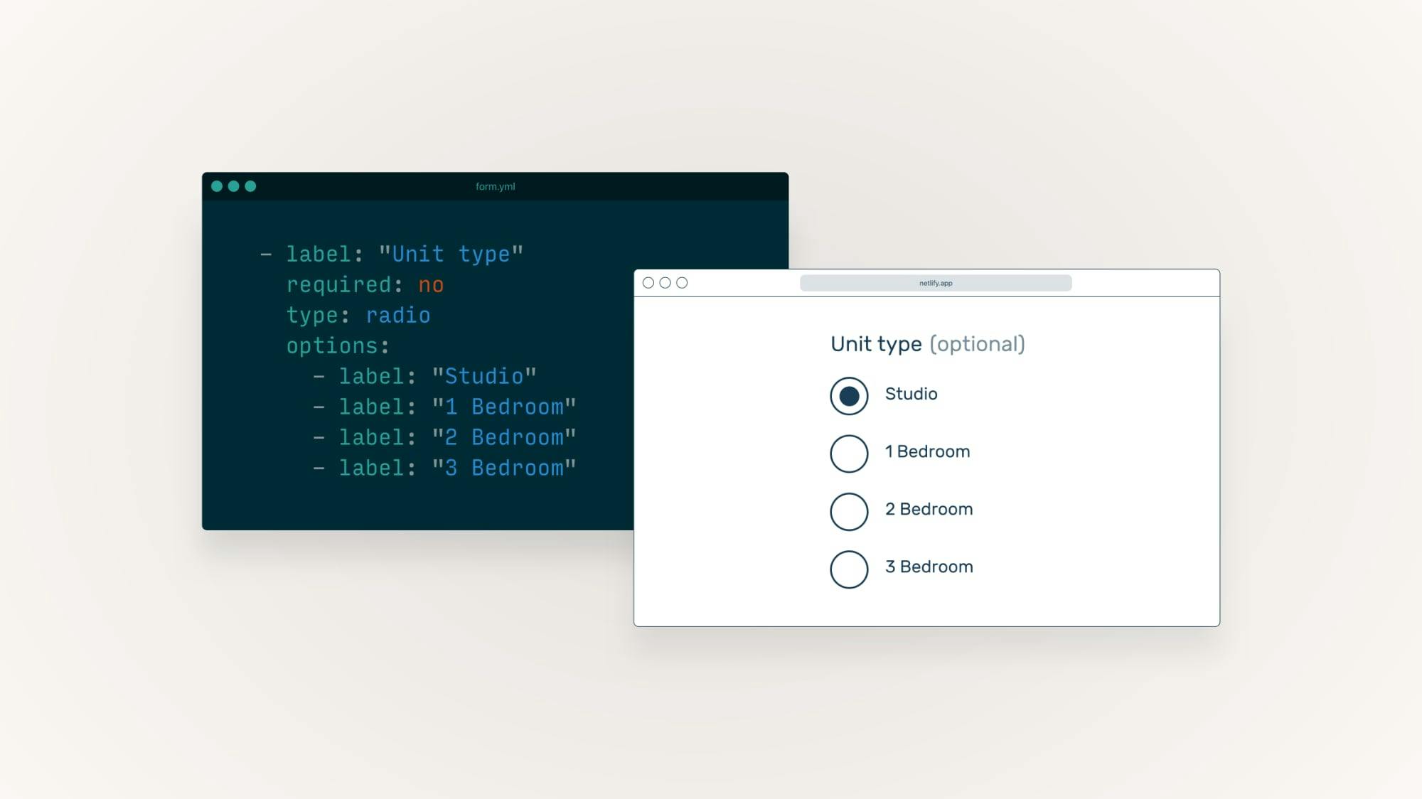
Before designing the rule editor, I wanted to finalize a list of our supported triggers and actions to understand our constraints.
To do so, I sifted through customer feedback, read support requests, and analyzed process flows from large government agencies.
When someone…
 Submits a response
 Edits the response
 Changes a status
 Adds or removes labels
 Gives a specific answer to a form field
 Rates the response a certain score
Then…
 Reassign the response
 Move it to the trash
- Change its status
- Add or remove its labels
This also gave our CTO enough information to start working on the backend: helping us prove the project’s feasibility, reduce unknowns, and gain confidence we’d ship on time.
Designing editor interactions
I enjoyed a highly collaborative working style with our CTO. To start, I handed off the fewest design artifacts needed to start working in code. From there, we’d toss the PR back and forth, iterating and refining until we both felt comfortable signing off.
This organic working process helped us make major course corrections early in development without much stress, and the shortcut editor’s a great example.
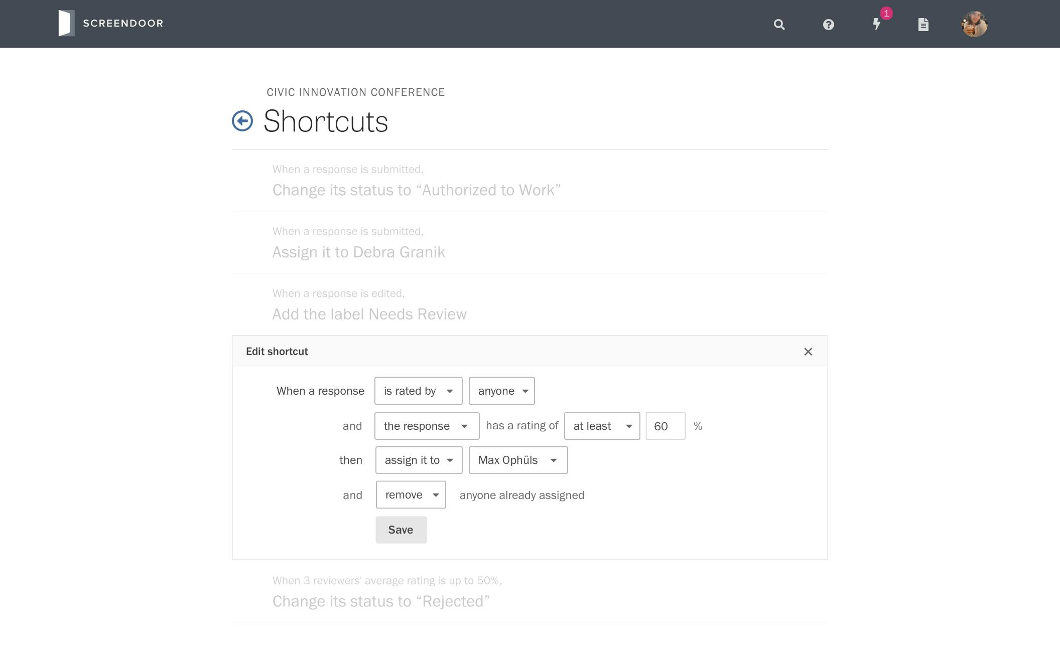
My first mockup of the rule editor let users edit every rule simultaneously. Rules were also sorted by the date the user added them. For simplicity’s sake, there wasn’t a Save button: instead, we’d save the user’s changes in real time.

I created this mockup before shipping our design system, so it uses our legacy styles.
I handed off this mockup to our CTO, and a few days later, he sent back a rough PR. Immediately, I noticed a few usability issues we hadn’t anticipated.
-
Sorting rules by creation date made the page harder to scan. When trying to edit a project with 5–10 rules, it was hard to know where to find the rule you wanted to change.
-
Our dropdowns were visually overwhelming. Our dropdown borders had greater contrast than the separators between each rule, making the page harder to visually parse.
-
Our CTO’s preferred technical architecture required we place a “Save” button below each rule. For example, if there were ten rules on the page, the editor would display ten Save buttons. This could get confusing quickly. After some quick back-and-forth it became clear that any other UI for saving would add weeks of development time, and I’d need to figure out a way to make the existing method user-friendly.
After brainstorming with some quick 2×2 matrices, I decided to add a new default read-only state to the editor. We’d display a brief prose summary of the rule’s logic, and the user could press a button to toggle the edit state.

This mockup uses a new icon set I was planning to introduce alongside our design system. We ended up scrapping it before we shipped.
The edit state would contain the Save button, hiding it by default and making the page easier to scan.
The default state also reduced the height of each rule, making it practical to turn the UI into a sortable list. I hypothesized users would want to arrange rules in the chronological order of their workflow, especially if they were large agencies trying to copy their own process documentation.
I gave our CTO the above Sketch mockup containing every variant of UI copy we might display, alongside a rough Principle prototype of the transition between states, and a detailed summary of my changes.
Designing system feedback
As per my research, we also needed to give users feedback when they’d triggered automation. If they’d done so by mistake, we also needed to show them how to fix it.
At first, I tried showing contextual notifications under the UI component that triggered a rule, thinking this would make users more likely to notice the message and understand the shortcut’s origin. But we scrapped this quickly after realizing how many bespoke notification types we’d need to build.
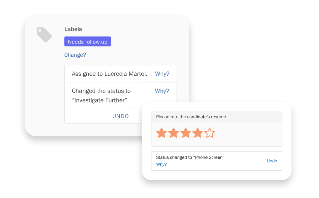
Instead, we used our standard notification component, which always appeared in the bottom right corner of the screen. We reasoned that we could change the design if it proved to not be discoverable.
To illustrate the flow, I altered live UI components in Chrome’s developer tools, captured them with screenshots, and composited them into a mock screencast with Final Cut Pro.
Each notification had one or two contextual actions, depending on the user’s permissions.
-
View Shortcut links to the shortcut editor and highlights the rule the user just triggered. From there, the user can edit or delete the rule if they had the appropriate permissions. (In the mockups above, this link is called “Why?” instead. We changed it in response to critique.)
-
Undo lets users reverse a trigger’s effects if they immediately know they’ve triggered a rule by mistake, and they’re allowed to perform the same action manually.
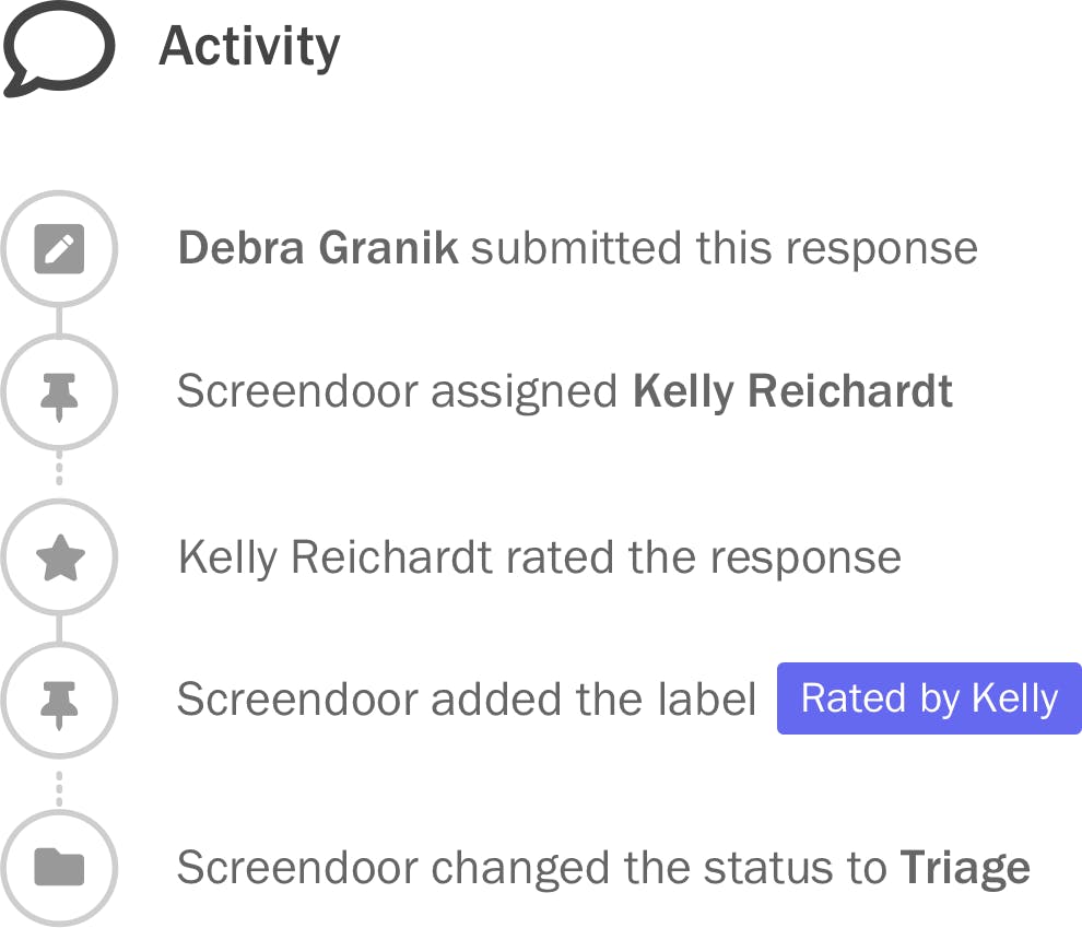
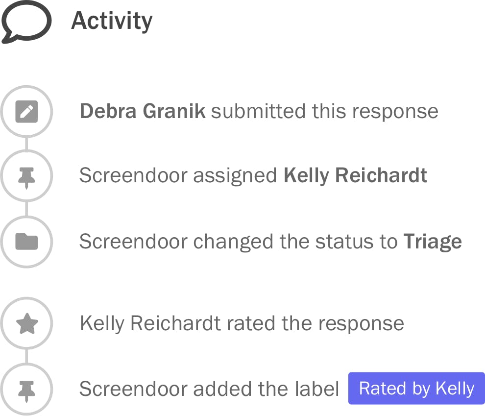
Designing transparent logging
To help users diagnose issues with shortcuts, I modified the activity feed that appears below each submission, using connected circles to chain triggers and actions together.

This created an interesting dilemma. Since automated actions could tax our servers, we planned to execute them in the background. So a user could potentially change the response before a shortcut could take effect, thus “breaking the chain” in the feed.
We ended up reordering the events in the feed to keep the chain intact, deciding to prioritize a coherent narrative over the canonical timeline. If users needed to see an event’s timestamp for any reason, they could do so by hovering over it.
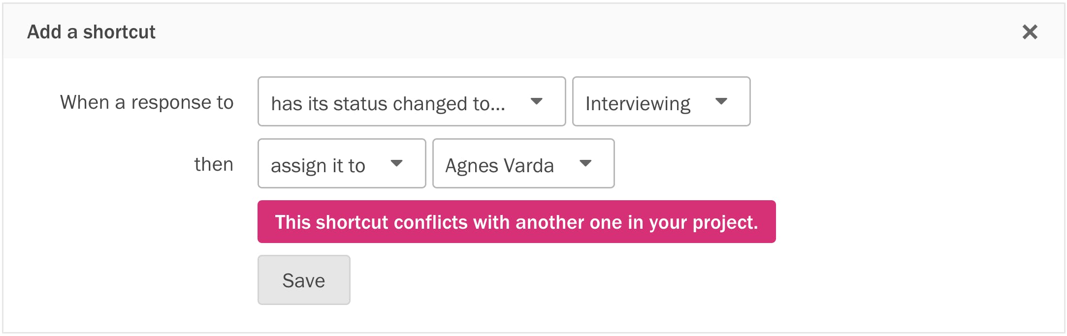
Avoiding paradoxes
To reduce scope for our MVP, we only let users add one trigger and action per rule. This meant you could easily create an accidental paradox: two rules with identical triggers but conflicting actions.
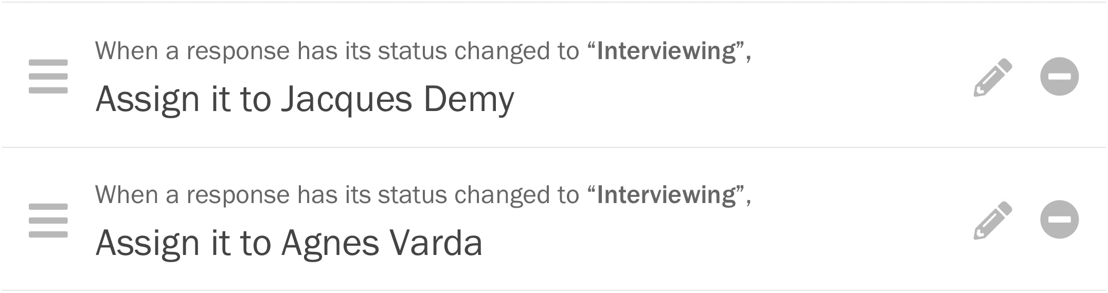
To prevent this, we had to anticipate every circumstance in which a paradox might occur, and validate each input field accordingly.
Cleanup mode
After nailing down the broad strokes, we put our heads down for a few weeks and brought the project to a suitable level of polish for an MVP. We logged bugs, gaps, and enhancements for each other inside a GitHub milestone up until the deadline.


For ‘contains’ triggers, if we implement #2658, we could just have ‘edited’ and ‘submitted’ items in the activity feed. This lets us keep the activity items short, while still helping admins see how a shortcut was triggered.
Because we set a fixed development timeline, refrained from granular upfront estimates, and achieved consensus around outcomes before starting development, we could re-prioritize tasks as we saw fit without constantly readjusting the team’s expectations.
It took a few projects for us to learn how to do this efficiently inside a remote team. When you’re working across timezones, any ambiguity in a design requires multiple rounds of back-and-forth to resolve, wasting precious time. Thankfully, by the time we started work on shortcuts, I’d already learned to balance speed and precision: handing off low-fidelity artifacts I could produce quickly alongside concise prose to describe state changes, edge cases, and visual detail.
Marketing
Our competitors associated automation with freedom from human labor, while we emphasized human oversight and easily fixing the computer’s mistakes. We didn’t want users to delegate responsibility to a machine, but rather save some time and cognitive overhead.
After brainstorming how to best communicate this mental model, the word “shortcuts” seemed to encapsulate what we were looking for. To minimize customer confusion around a potentially unfamiliar term, we always mentioned shortcuts alongside the words “workflow” and “automation” in product marketing.
I wrote, directed and animated this Screendoor explainer video that mentions shortcuts.
Impact
Shortcuts exceeded expectations in the metrics DOBT valued highly.
10K+ shortcuts triggered each week
Given the size of our customer base and the average number of submissions per form, this was a very respectable number for us.
Reduced support volume
Our support requests for automation essentially vanished overnight, and we also received few tech support questions. These were two indirect indicators that people who needed shortcuts could use it without help.
Increased deal size
We won a sweeping deal with a major state government agency, largely based upon a demo showcasing shortcuts. This had a huge impact on our sustainability as an early-stage bootstrapped company.
Process changes
As an early-stage, bootstrapped flat organization, short-term revenue potential was the team’s biggest motivator. It was hard to make the case for important product work unless a valuable RFP happened to request it.
This affected both our priorities and product quality. For example, while we designed shortcuts, we found that a valuable RFP that had automation as a requirement, and the team started evaluating solutions against the RFP rather than our research. They believed the request represented a broader market demand: if we fulfilled it, everyone would be happy… including our current customers.
After we shipped shortcuts, I knew we could disprove this with data, so I worked with our support lead to track every feature request in a Google Sheet.

- Customers. One per column, alongside their name and deal value. No sales prospects, only real users.
- Features. One per row. We listed their GitHub issue number, so colleagues could find resources and discussion around that feature if they were curious.
- Requests. Alongside the number of requests the customer had made, we linked to the original conversation in Front, our shared inbox. This gave us an organized database of primary sources to inform new design work.
After a few months, we accumulated a healthy backlog. Colleagues started to notice that sales prospects and RFPs asked to solve problems our customers didn’t think were important. They began to realize conversations with buyers didn’t represent user needs.
The spreadsheet also got us to communicate more across disciplines. We started tagging prospects in our CRM with their feature requests. Now we could objectively compare what large agencies wanted and our users needed.
At first, I triaged each request myself and tagged the appropriate issues. But going forward, I wanted to help colleagues update the spreadsheet on their own. So I taught them how to clarify the root cause behind customer requests, by asking diligent follow-up questions and empathizing with the user’s core problem.
The company was small enough that we never scaled up this process during my tenure. But I’d still love the opportunity to do so! Maintaining a repository of customer knowledge helped the product team be more effective. Teaching skills like active listening helped the whole company be more humble.
Summary
Shortcuts embodies the way I love to work: highly collaborative, outcomes-focused, and equally focused on the organization’s ability to produce great work as the work itself.
Outcome: Allow admins to view shortcuts in an order that matches their existing workflow.
Structure / Interaction: Let admins drag shortcuts in the editor to reorder them.