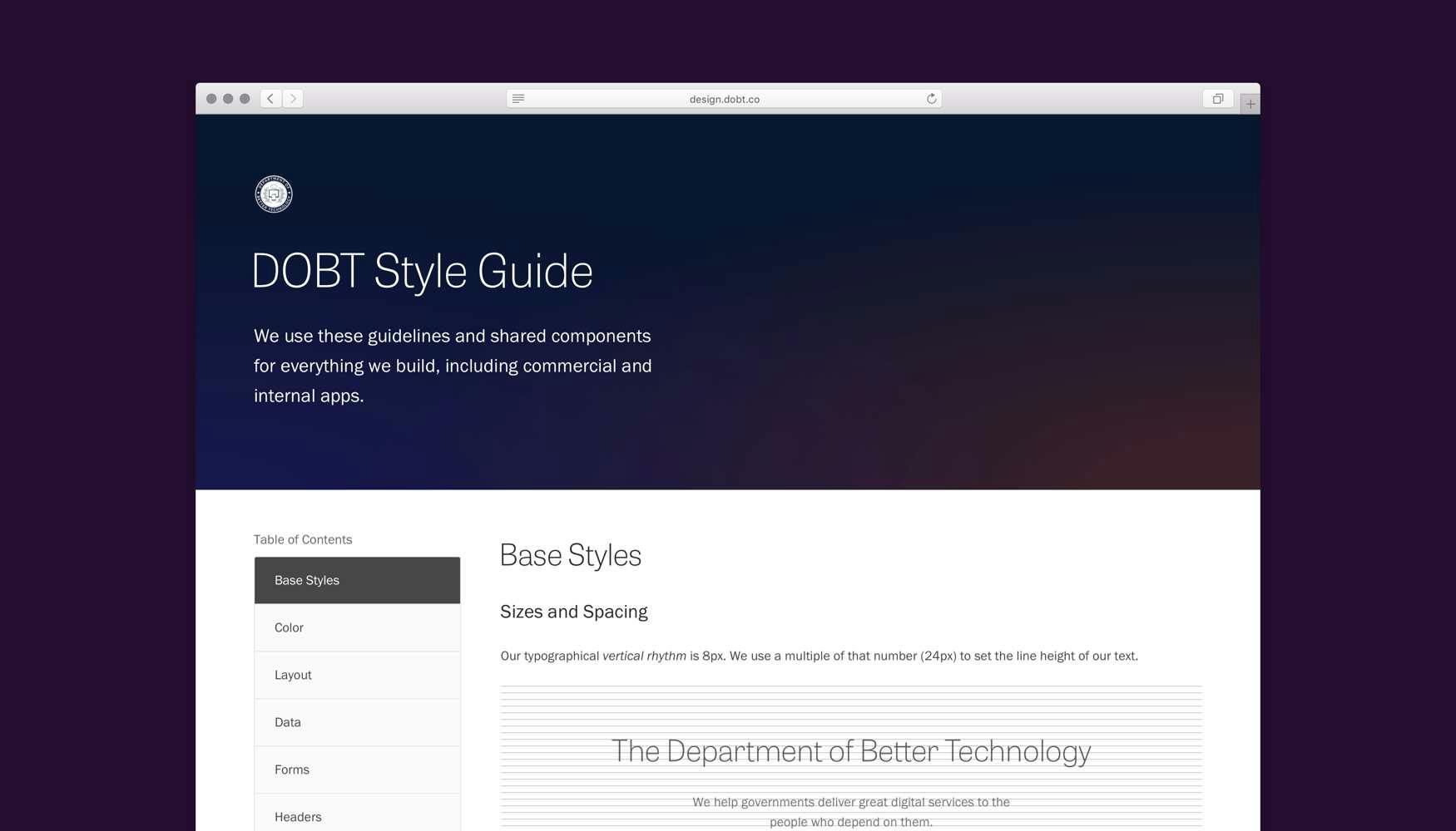
This was a huge project with multiple goals. We wanted to enforce aesthetic and code consistency across all of our software, and to give engineers a component library with which they could easily build new features. Finally, we wanted visual unit tests for our basic UI components, letting us diagnose design bugs without manually navigating through each app.
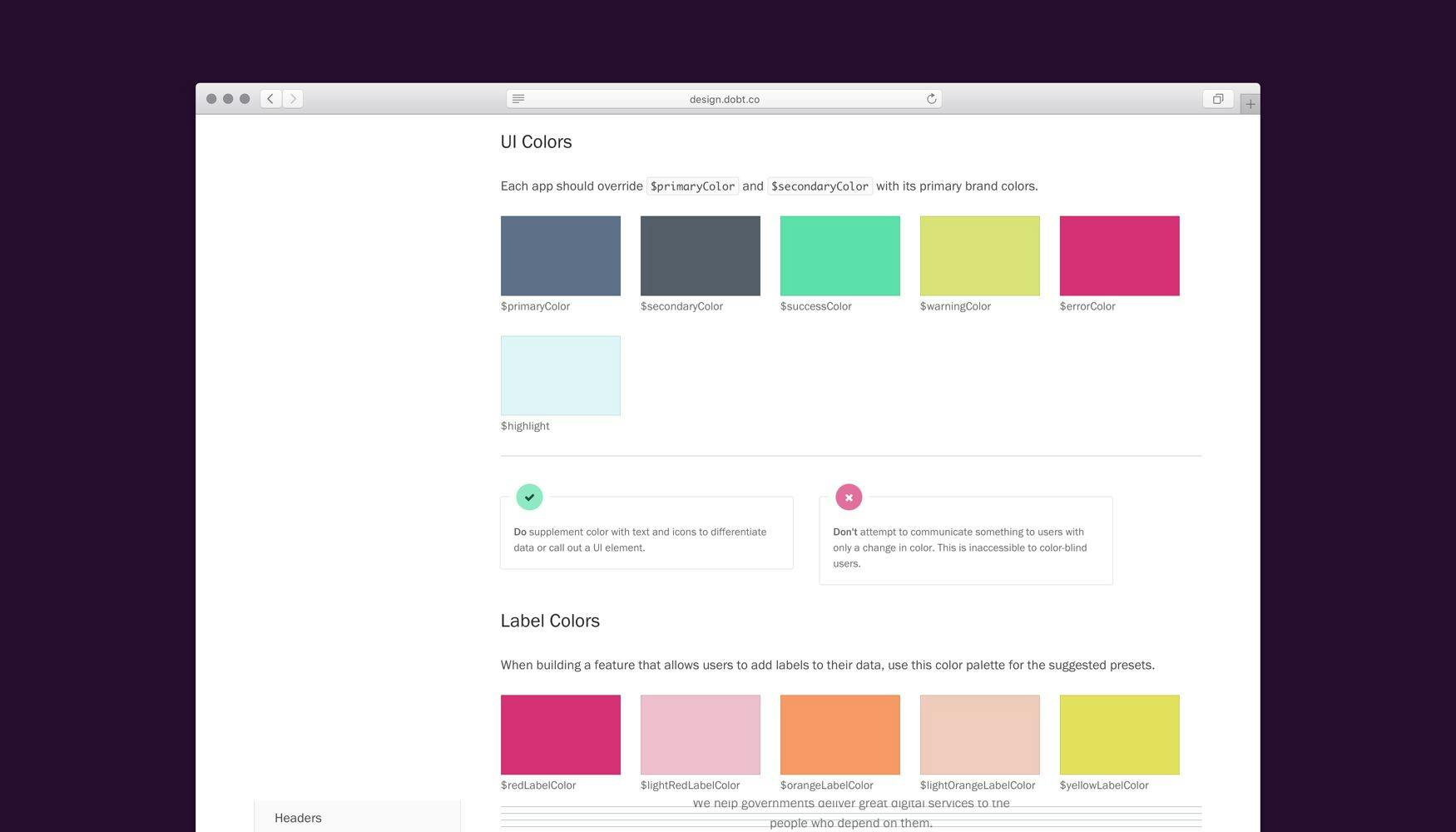
After conducting an exhaustive pattern inventory and refactoring a lot of SCSS, I wrote and designed a style guide that documented each UI component alongside its source code. I also wrote recommendations that defined the proper usage of each component.